
A wintersports application based on gamification.
UI DESIGN, UX DESIGN, MOTION, BRANDING
Traverse, verb
tra·verse | \trə-ˈvərs also tra-ˈvərs or ˈtra-(ˌ)vərs.
traversed; traversing
transitive verb
A: to go or travel across or over.
B: to move or pass along or through.
DESIGN CHALLENGE

How can an interactive product help make winter sports enthousiasts excited about exploring while competing and sharing their activities with each other.
A new experience
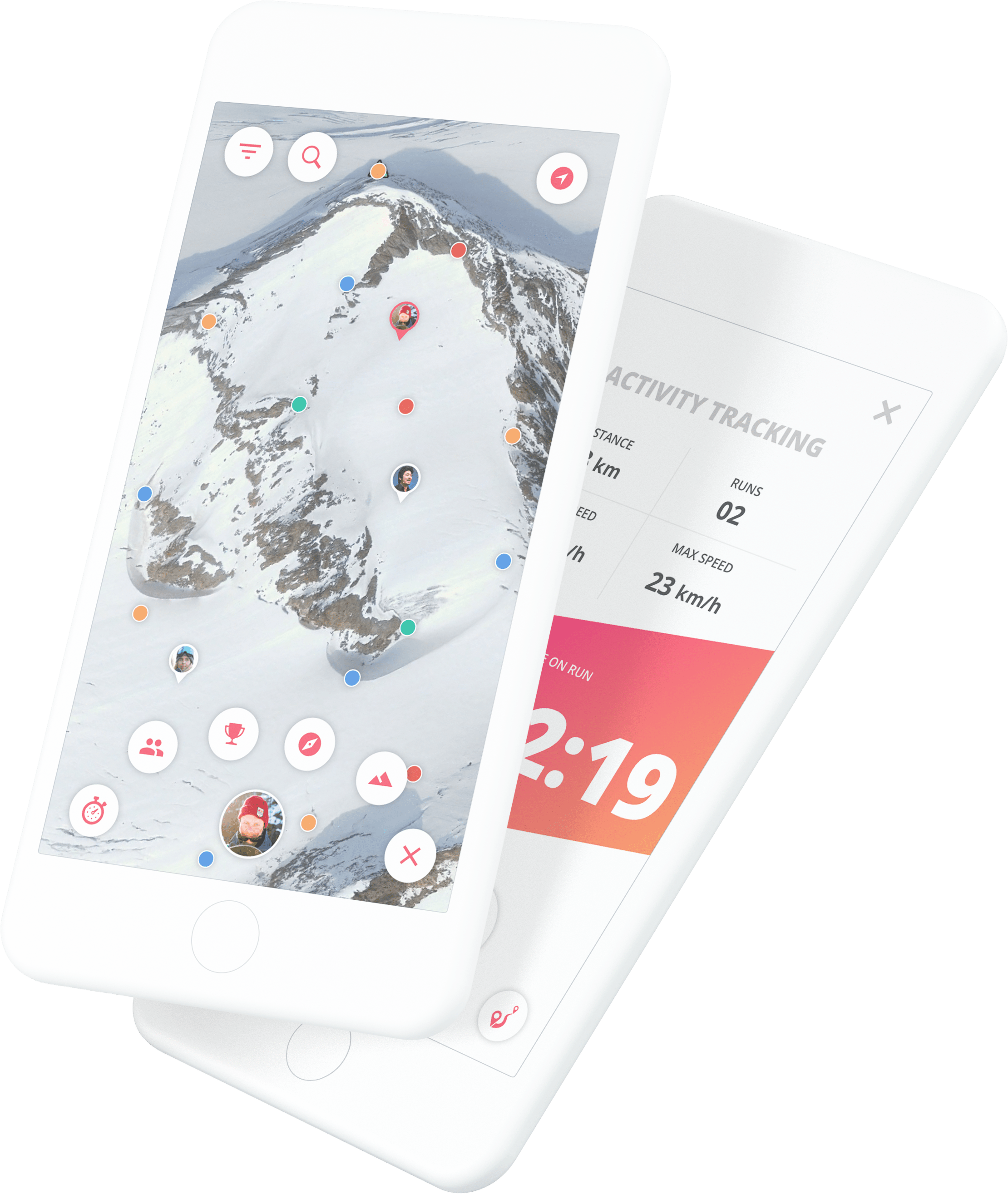
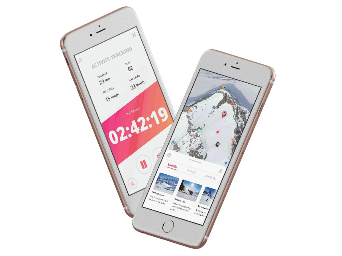
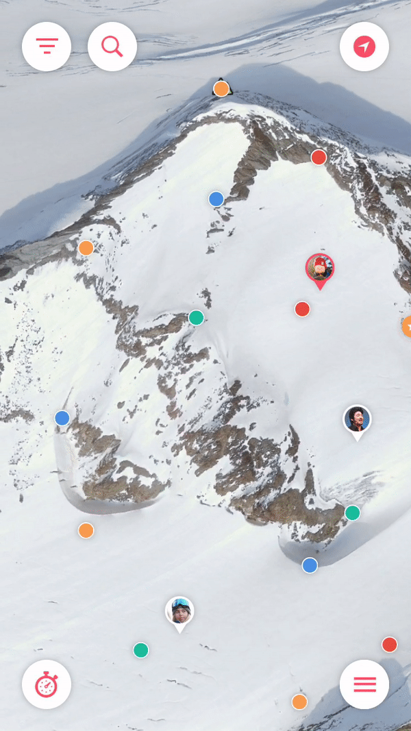
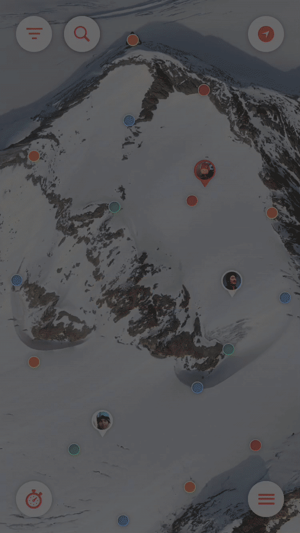
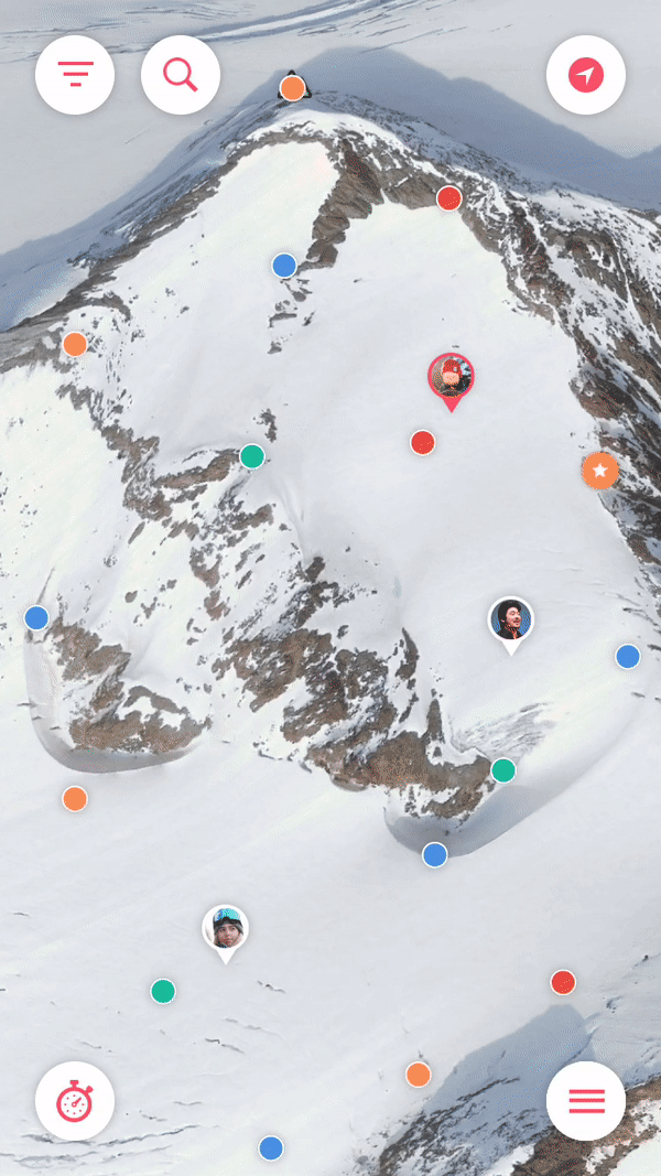
The concept for this application is a 3D ski resort map and information application with gamification elements. The concept is an idea based of the fact that there is not one app that gives a ‘full winter sports experience’, there is always a need for another app or internet page to get all the ski resort information needed. Will it be finding friends, finding a place to eat or wanting to know tomorrows weather forecast, this app will give winter sports enthusiasts a reason to use one application only, this one.
The style
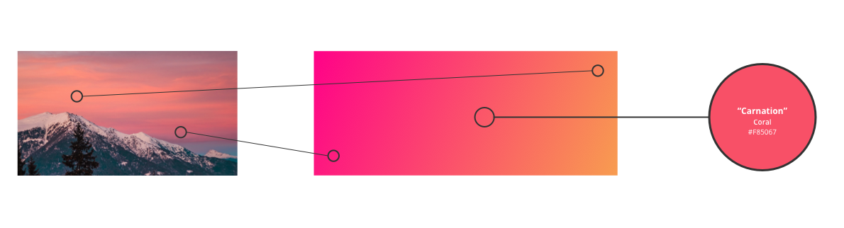
White powdery snow and clear blue skies, when having to imagine wintersports these two things pop up inside your mind easily. I guess this is the exact reason behind giving a winter sports app a white and blue color scheme. This is the exact reason I chose to experiment with more energetic colors.
Sunsets and sunrises on snowy mountains often give an orange-y or pinkish glow onto the pure white snow. I used this as a starting point for what later became my main color.
A focus on micro interactions
From the start of this project I knew I wanted to focus on micro interactions to be able to keep the users hooked on the details. Small feedback moments in the app that truly stand out.
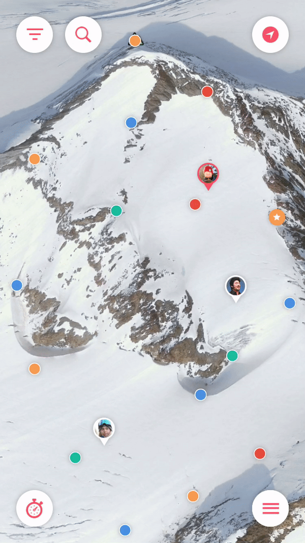
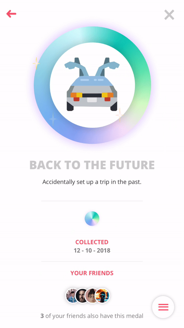
Gamify the experience
Gamification was a big part of the project from the very start. Traverse is based on the Octalysis Framework by Yu-Kai Chou and focusses on the 8 core drives of human motivation to keep the users interested and motivated.
Best of both worlds
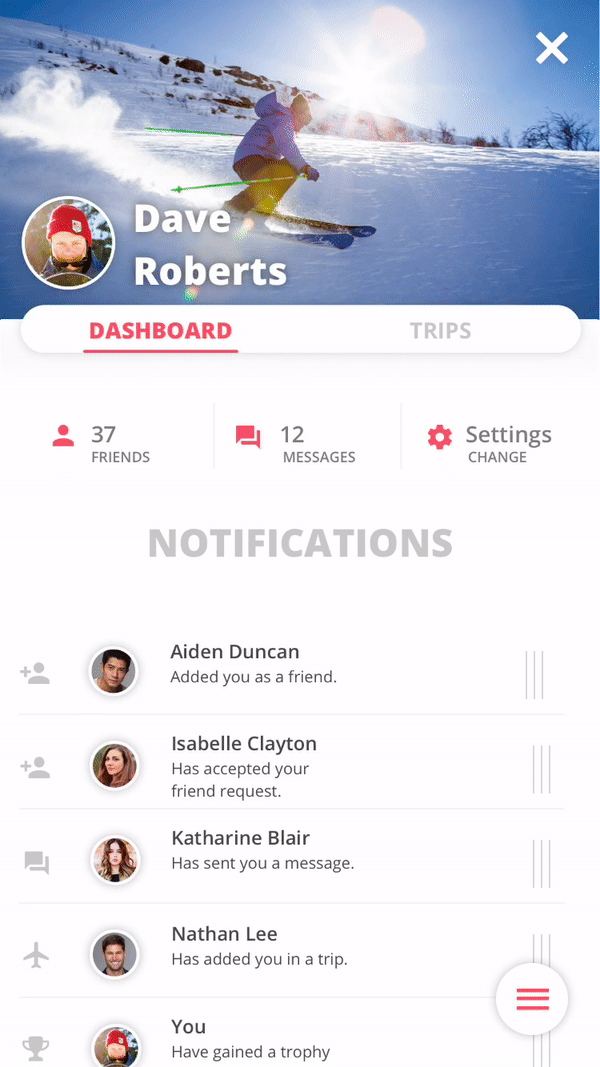
There was no wintersports based app with all the features, that is one of the main reasons the idea for Traverse came into existence. No more downloading 3 apps while having a internet page open with the weather. One for all, all in one.
Devices
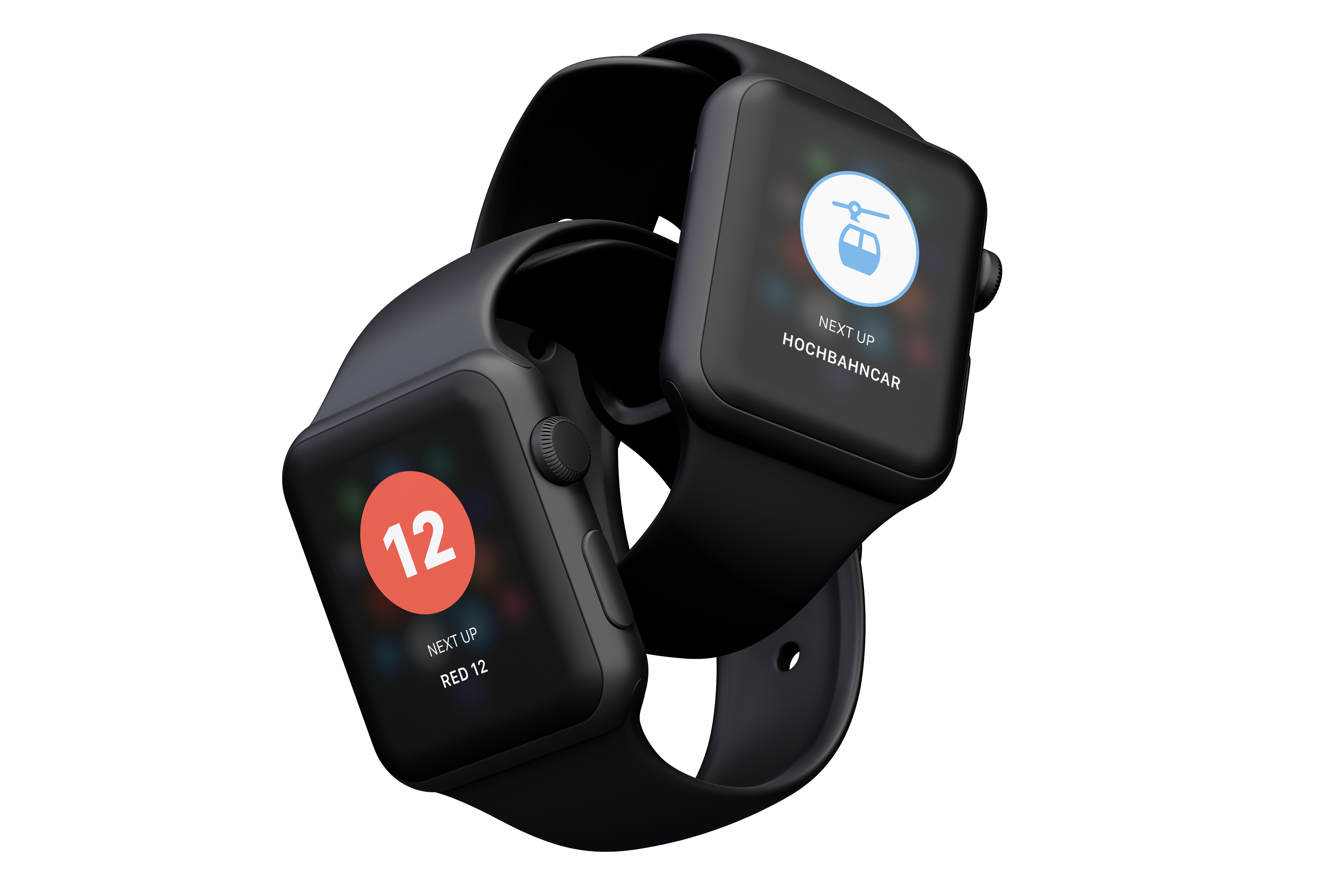
Not only was the app thought out on mobile devices, wearables also have a great impact on sports apps / products. Wearables were booming in sports at the time so a Apple Watch notification system was a logical step in the right direction.
THE CONCEPT
A winter sports application based on gamification that inspires its users to explore their mountains, challenge their friends and bring out the best version of themselves.
Just a glimpse
As you may have guessed, this is not all of the research I have done on this project. All the research and more information about prototyping, visual-, interaction- and motion design can be read in the online Product Biography. Just click the button below!
Product video
A video not only to show off all the features and the design, but also to give the viewer that winter sports vibe. This was used during the final presentation and graduation ceremony.
OTHER WORK

© Dale Schnieders 2020
UI / UX Designer
Based in Haarlem
schnieders.ds@gmail.com