
A cheerful mobile escaperoom for children.
BRANDING, UI DESIGN
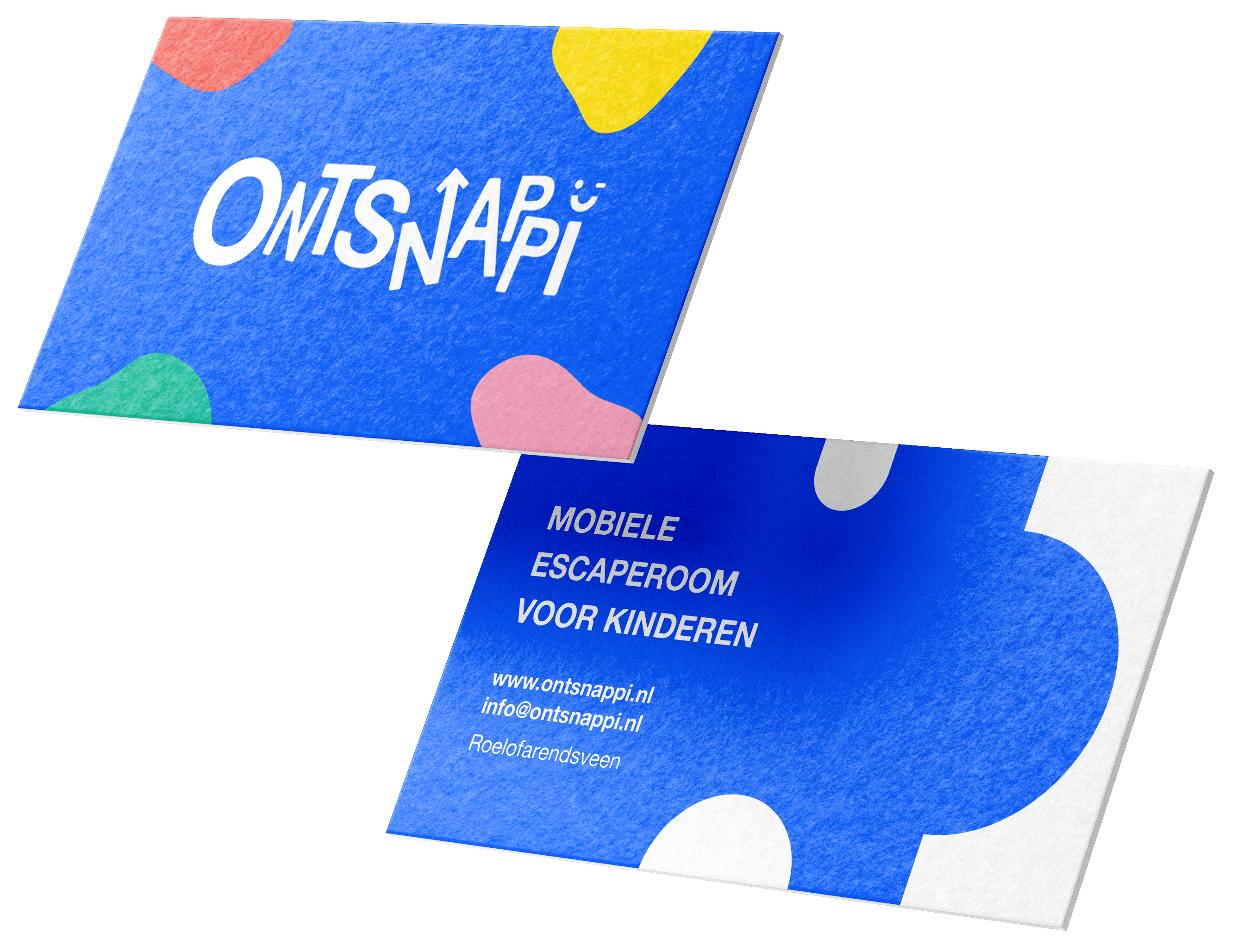
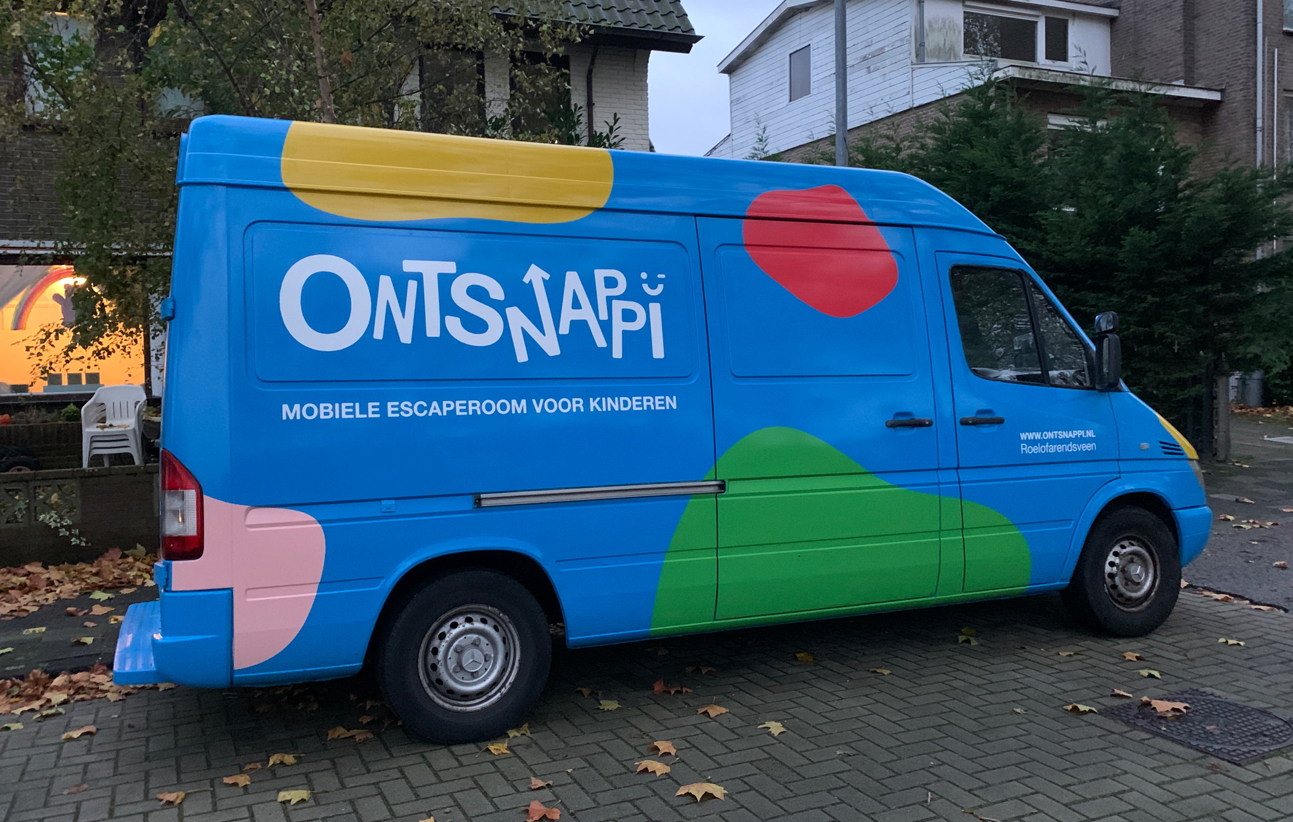
Ontsnappi is a mobile escape room for children from 8 to 12, built from scratch inside of a van.
The name comes from a combination of two Dutch words. With 'ontsnap' meaning 'escape', and 'snappie?' being a Dutch way of saying 'get it?'.
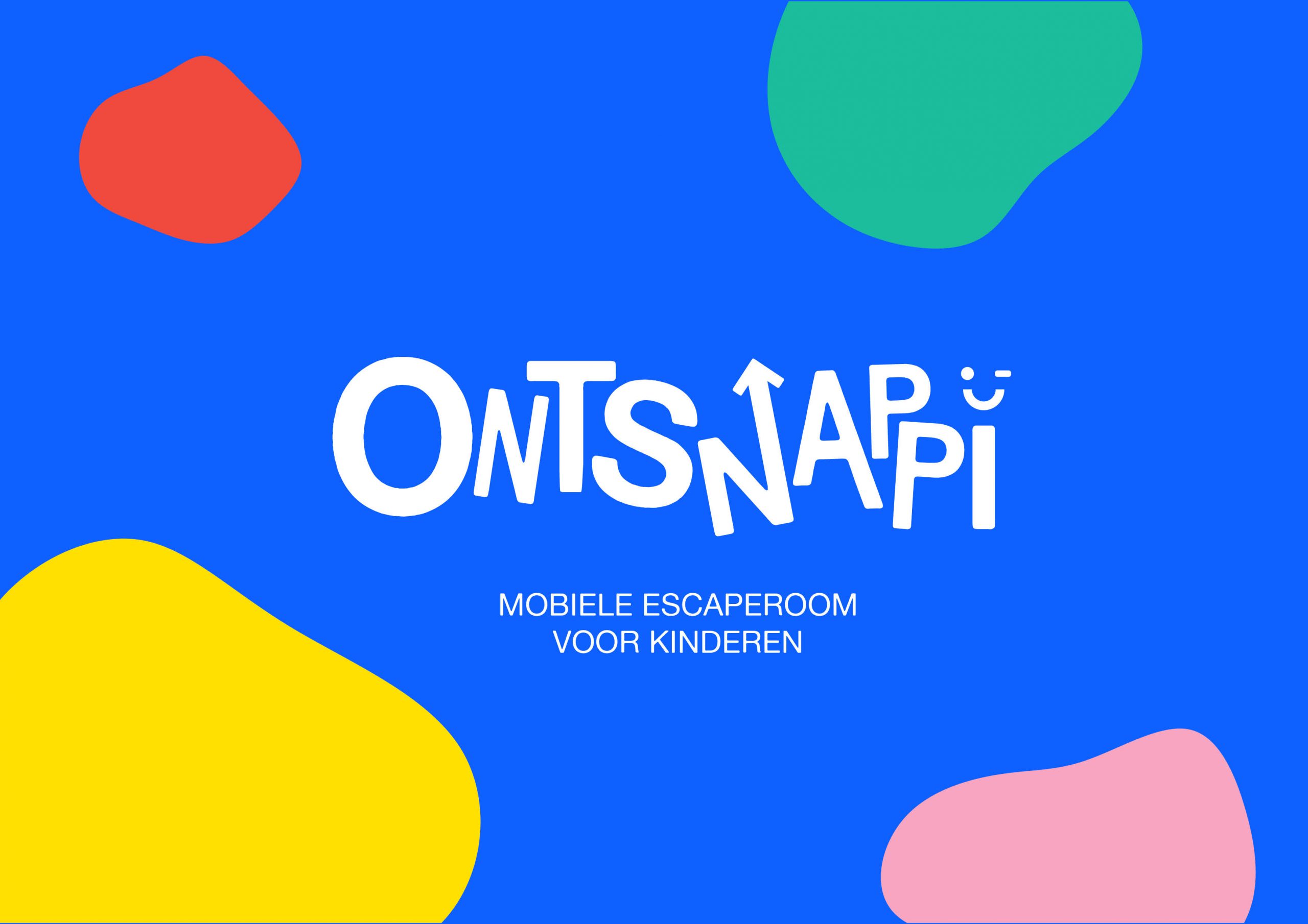
Child friendly fun, on wheels
I was tasked to create a branding for this new product. A few of the keywords I got when starting on the branding were 'cheerful', 'colorful' and 'fun'. The combination of the chosen colors are meant to represent these keywords and the vision of the owner.

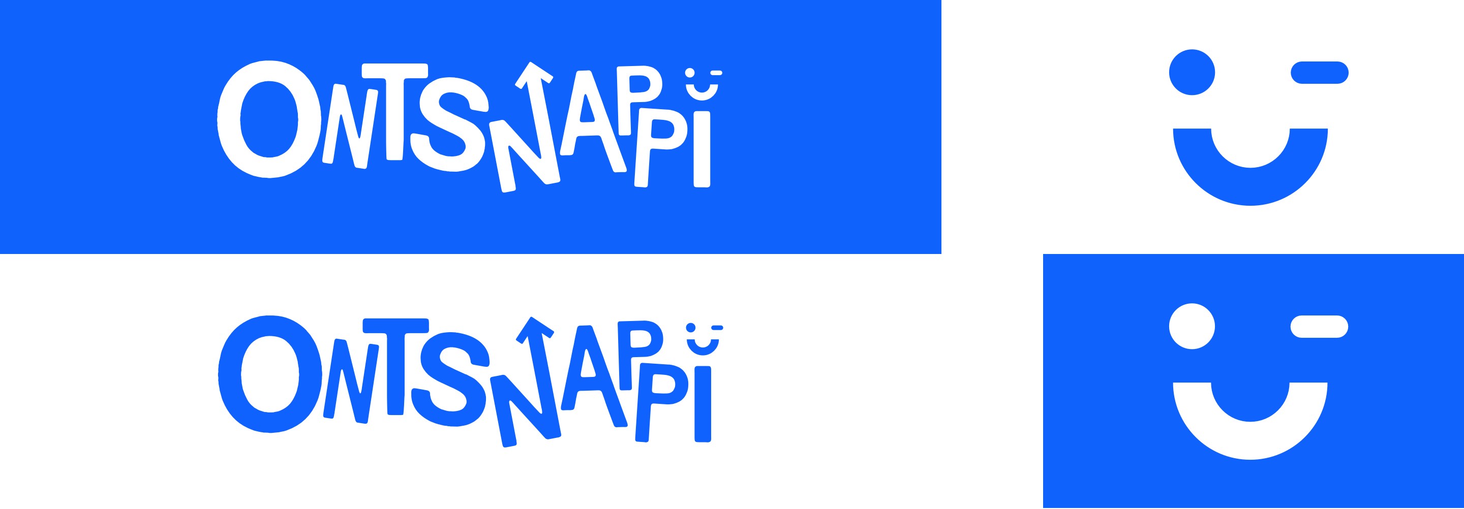
Logo
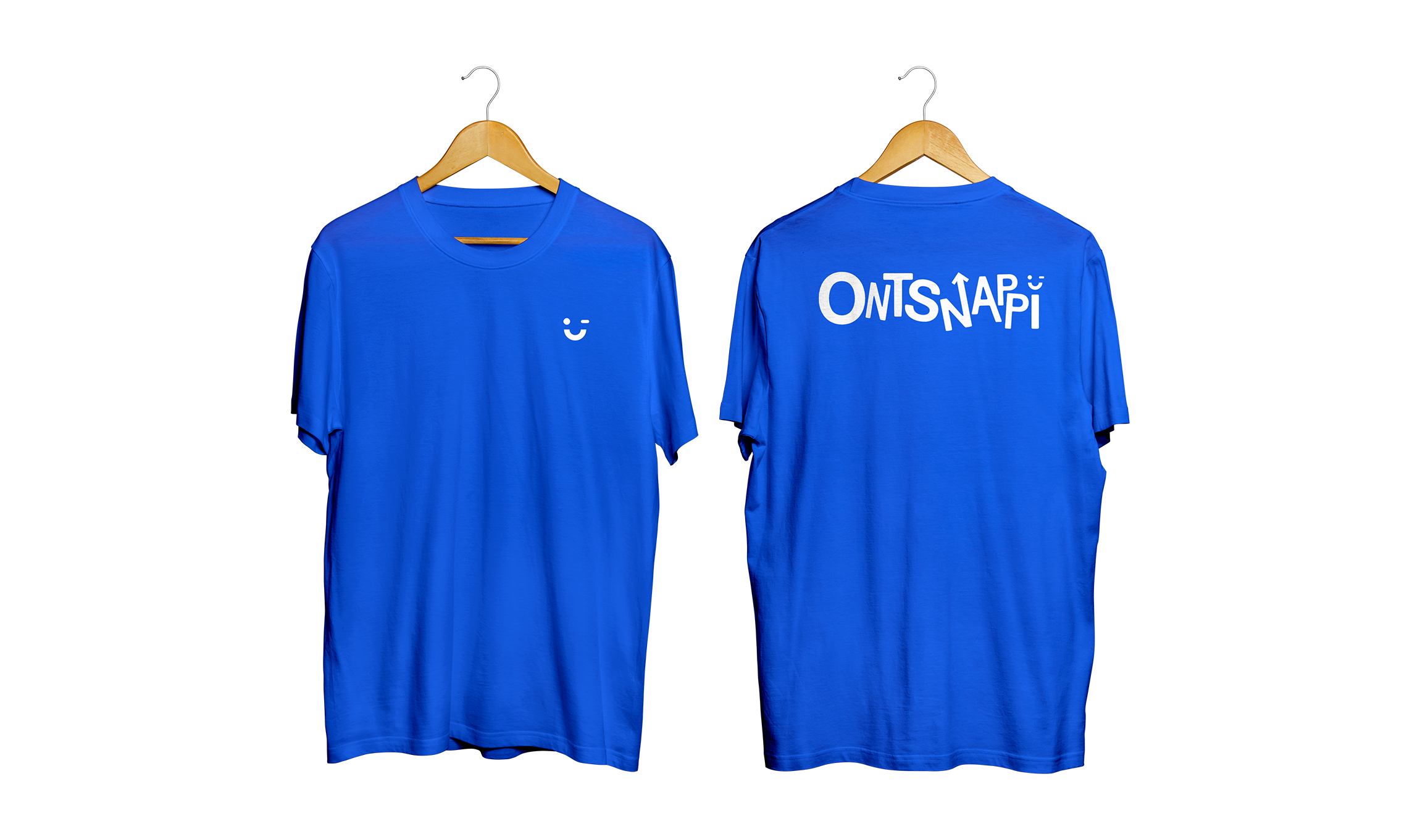
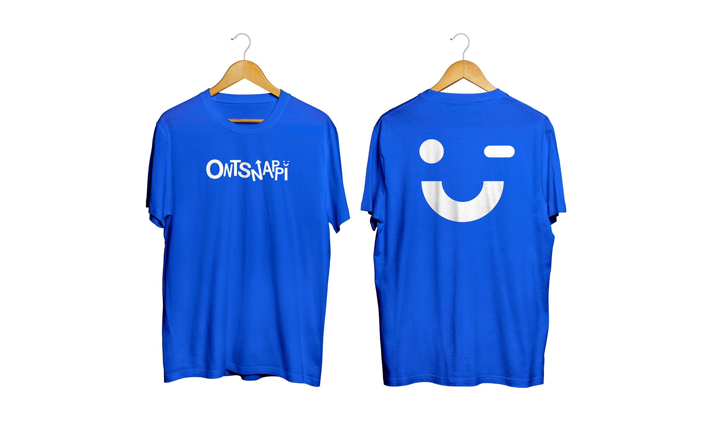
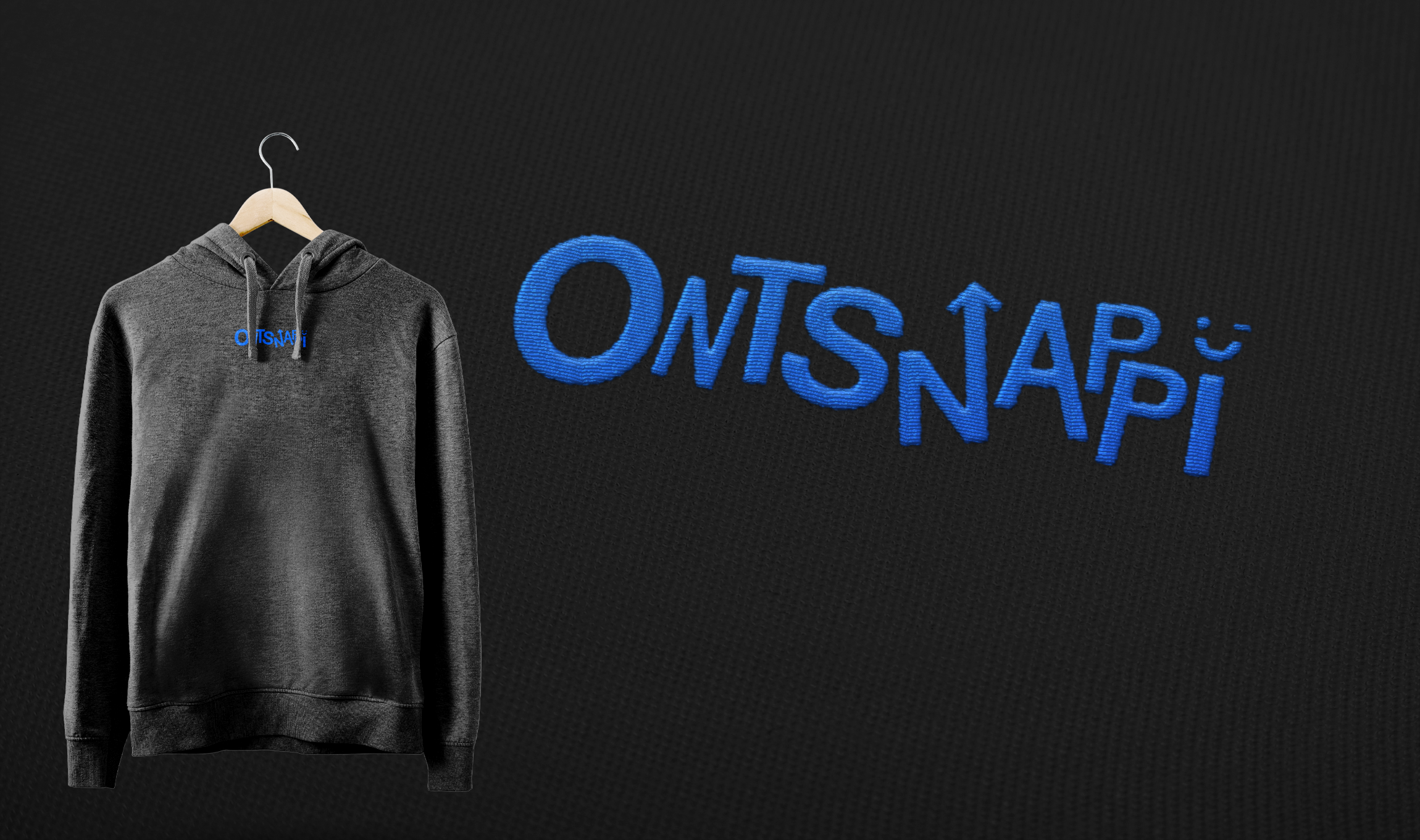
The logo is based on the target audience, 8-12 year olds. Which are notoriously energetic and always bouncing around. The blinking smileyface that dots the I will be used in various ways to promote the brand to eventually create a small but in a single glance recognizable aspect.
Branding
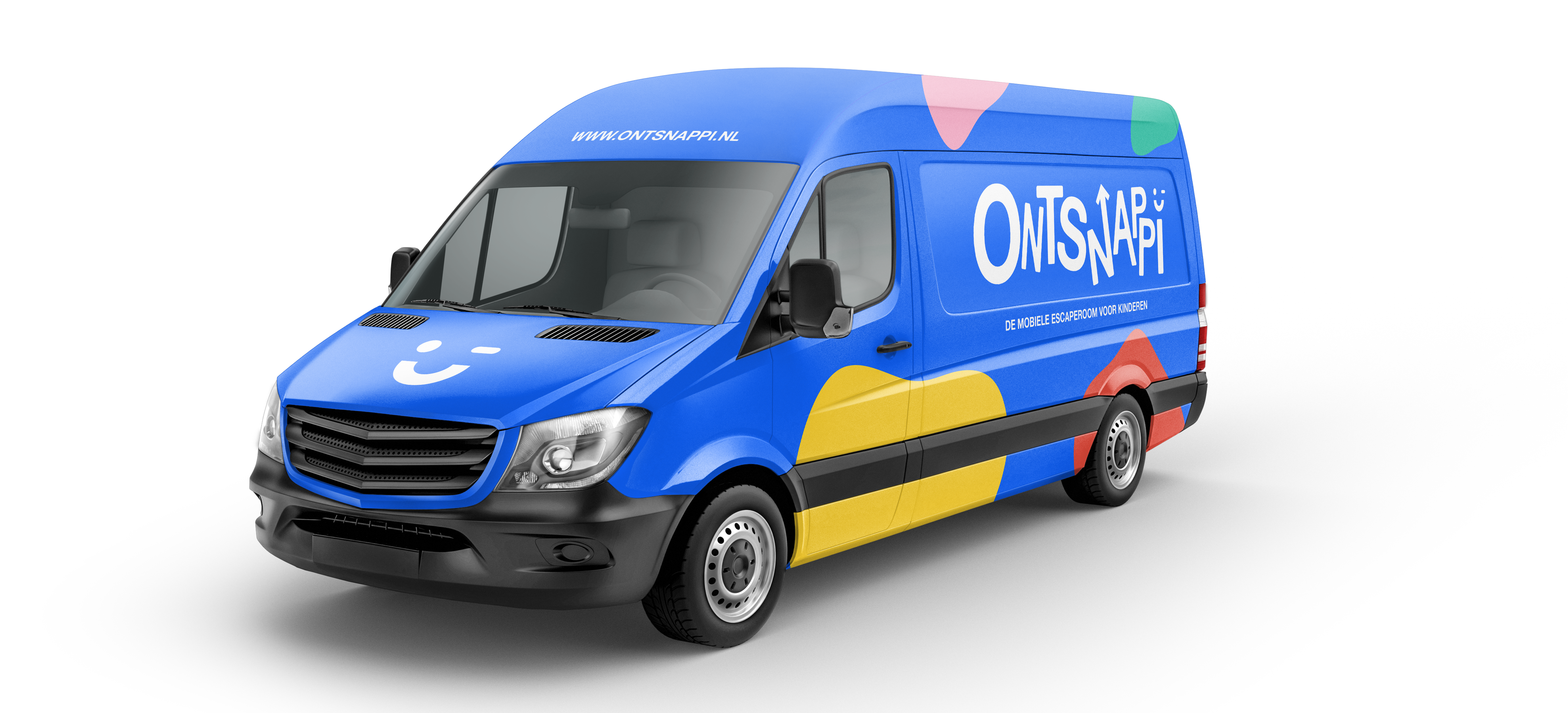
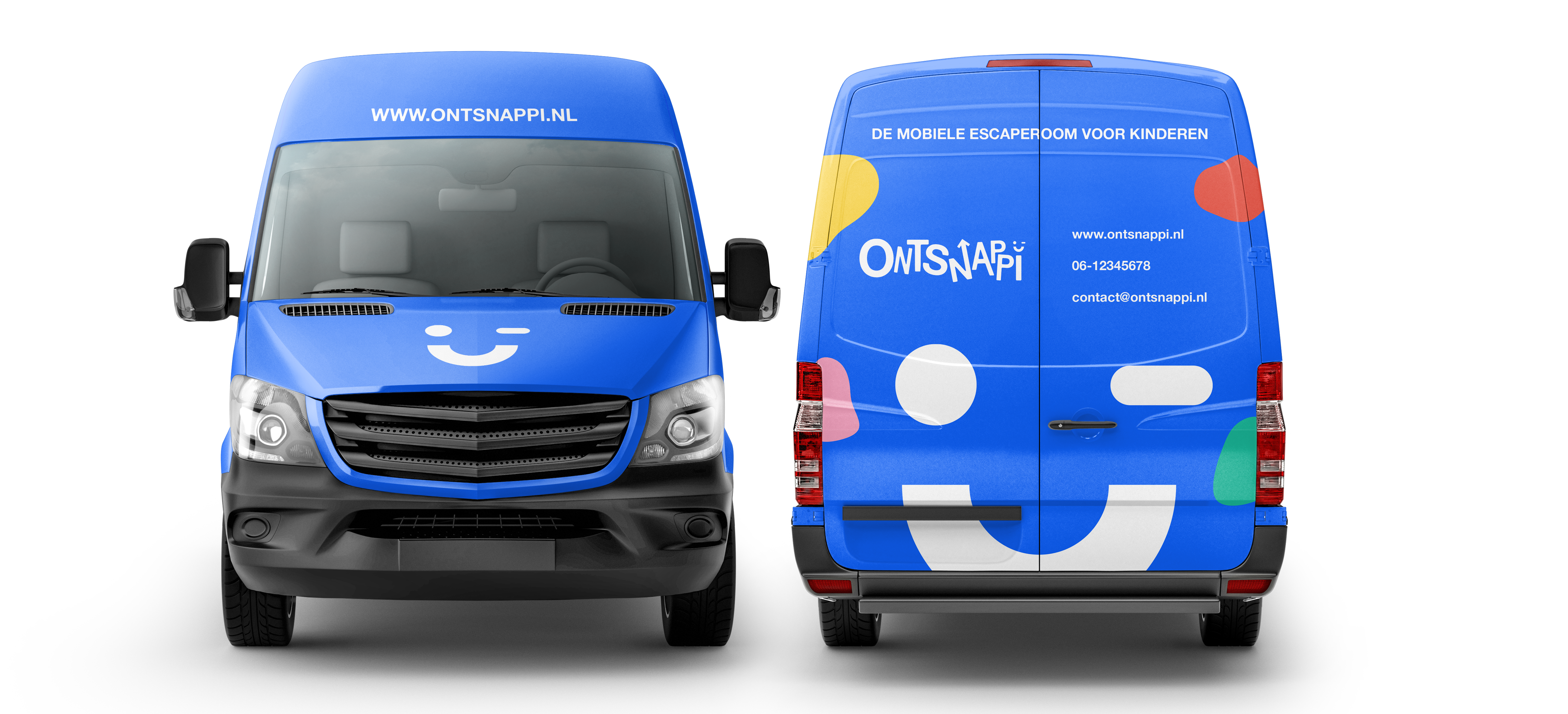
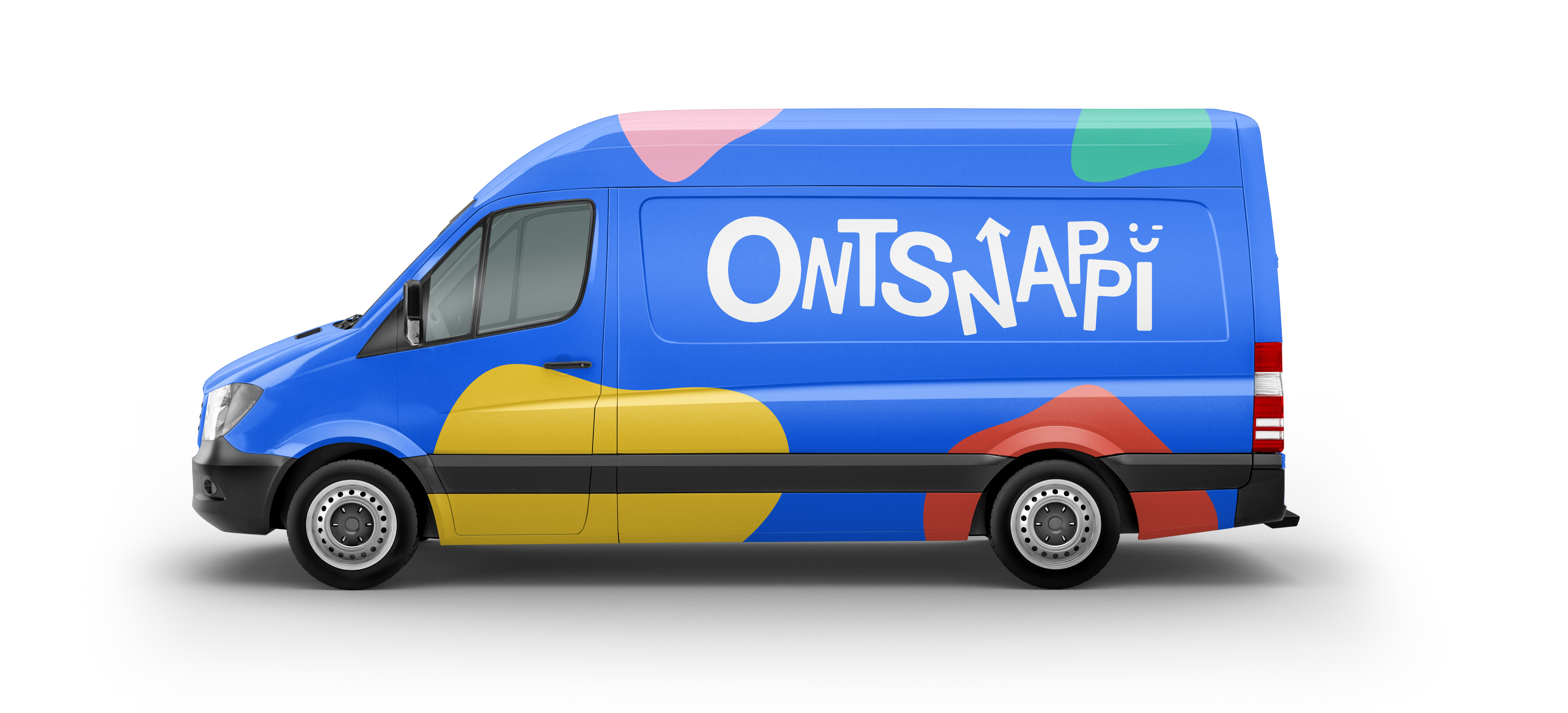
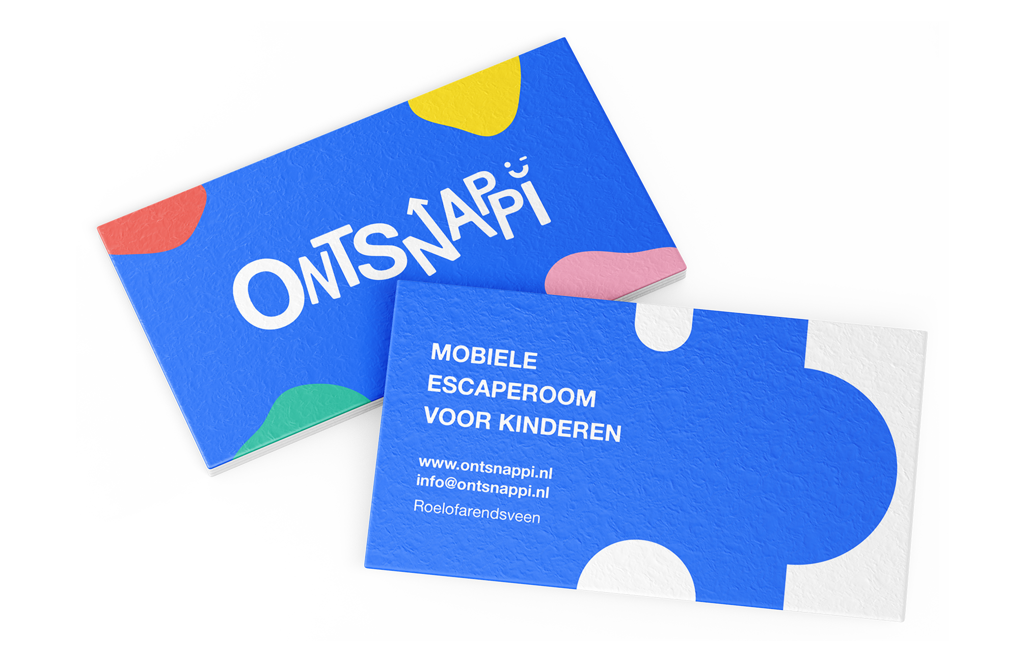
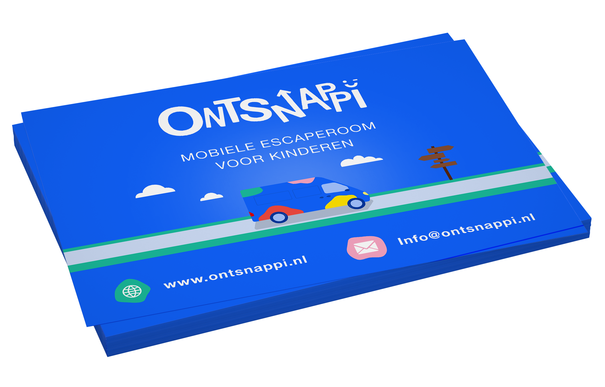
Ontsnappi is a brand that has a high word-of-mouth marketing potential with its energetic and fun appearance. The vibrant blue catches the eye immediatly, from the van itself to the apparel worn by the owner.

Website
One of the most important pieces to the branding puzzle is the website. The website is designed to show the fun and colorful branding while conveying enough information to persuade the parents to book an appointment. The website is under construction and will be live soon.
Ontsnappi, snappie?
The product itself, the van, got the branding treatment first and will be on the road soon.
OTHER WORK

© Dale Schnieders 2020
UI / UX Designer
Based in Haarlem
schnieders.ds@gmail.com